Schedule a Demo of Our Services
Complete the form below and we will be in touch shortly to schedule your demo.

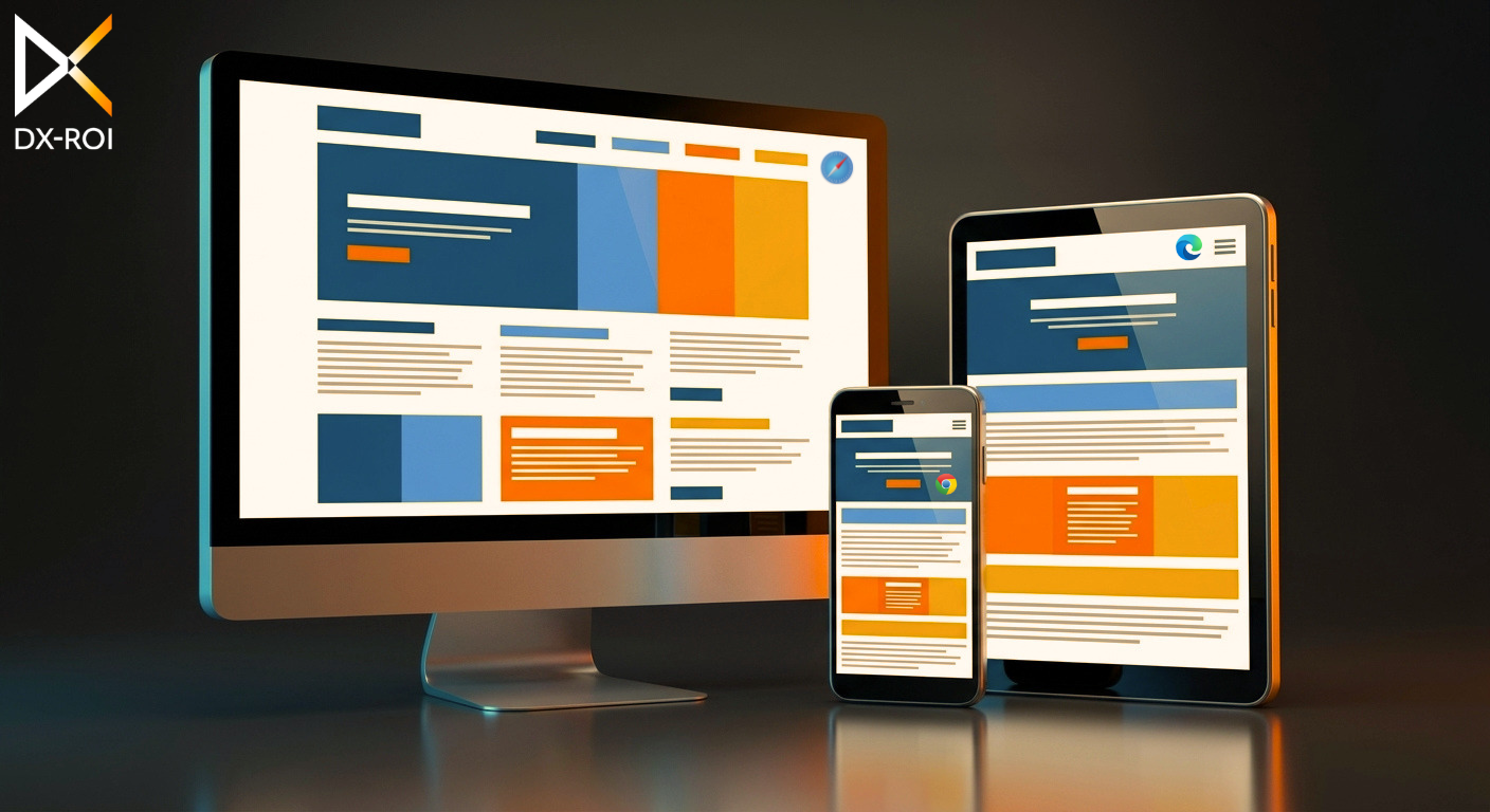
Working with Adobe Experience Manager (AEM) has shown me how powerful its component-driven structure can be. It gives teams the flexibility to build dynamic, personalized, author-friendly websites. But with that flexibility comes a familiar challenge: the same page can look slightly different or behave unexpectedly depending on the browser or device.
Maybe the font looks a bit bolder in Safari. Maybe a carousel behaves differently in Firefox. Or maybe a layout that looks perfect on Chrome desktop doesn’t hold up on iOS devices. These subtle variations can affect both design and functionality. That’s where a well-structured cross-browser testing strategy becomes essential.
In this article, I’m sharing the workflow and insights I follow to ensure AEM websites remain consistent across browsers and devices. This is the practical approach that has worked well for me on real projects.
After working on multiple AEM builds, I settled on a six-step workflow that helps catch issues early and avoid surprises later.
Before starting, I review analytics (when available) or market expectations to understand the most used browsers and devices for the website’s audience.
This helps prioritize where to focus testing efforts.
Testing begins with individual AEM components such as:
This is where I check alignment, spacing, responsiveness, and interactions.
Finding issues at this level prevents them from multiplying across pages.
Once multiple components come together in a page, I check:
Issues that don’t appear at component level may surface once everything is assembled.
I validate the UI across desktop, tablet, and mobile breakpoints to ensure layout consistency and usability.
Real device responsive testing is important because:
Even if everything looks visually correct, interactions sometimes behave differently across browsers.
I test complete flows such as:
This ensures both design and functionality stay consistent.
After any update or fix, I revisit important pages to confirm nothing else broke in other browsers. This one step prevents unexpected issues from slipping into later stages.
AEM is modular, flexible, and highly dynamic – all great qualities. But these also mean small browser-level inconsistencies can surface easily. Here are some issues I’ve repeatedly encountered while testing AEM builds:
lists and dropdowns behave differently across browsers.Because AEM pages rely heavily on reusable components and authored content, these inconsistencies can appear anywhere, making cross-browser testing a crucial step in ensuring a polished experience.
There are several well-known cross-browser testing tools in the market today – BrowserStack, Sauce Labs, LambdaTest, Katalon, and others. All of them offer strong capabilities, and it really comes down to what suits the team and project best.
For AEM projects, these capabilities matter most:
In my own projects, that checklist has pointed consistently to BrowserStack. While other tools like Sauce Labs and LambdaTest are strong options, BrowserStack’s combination of real devices, broad browser coverage, smooth debugging, and secure local testing makes it a natural fit for structured AEM testing workflows.
Cross-browser testing isn’t just about spotting visual differences – it’s about ensuring every visitor gets a consistent, reliable, and smooth experience. AEM’s component-driven nature makes this even more important, since a small browser inconsistency in one component can impact multiple pages. By following a structured workflow and using tools that provide strong browser/device coverage and secure testing environments, delivering consistent AEM experiences becomes much more achievable.
Test early.
Test thoroughly.
Deliver with confidence.